
If you’re a scientist working in biomedical research today, chances are the datasets you’re working with are getting bigger and bigger. We’re not talking about impact factor here (sadly)—the rise of multiplexed modalities and new technologies has made it possible to collect dozens to thousands of different parameters on a single sample, where back in the day an entire PhD would have been dedicated to achieving the same result. Obviously, you’re going to need to go beyond Excel and Prism to get the most out of this type of data, but where to start? In this article, I’ll be describing several real-life analysis solutions involving large datasets, written for non-computational biologists. Here's what we'll cover:
· Going digital: Moving your biological data to R
· Graphing heatmaps in R
· Graphing plots from high-dimensional data in R
· Finding biological meaning from significant parameter lists
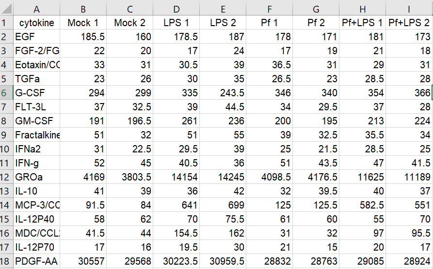
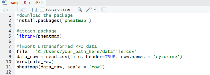
Here’s the setup: in my lab, we’re interested in innate immune cells and the proteins they secrete. So in order to avoid doing endless ELISAs to detect proteins one-by-one, I sent a set of samples to our friendly local core facility for custom Luminex analysis. Luminex is a bead-based multi-analyte profiling technology that lets you measure up to 100 proteins in a single sample (in this case, cell supernatants). It’s a pretty awesome and high-throughput way to get a lot of info out of a small volume of sample, and the particular assay I used was a human protein 60-plex kit—so for each sample, 60 parameters are recorded. Here’s an example of what the raw data looked like for me:
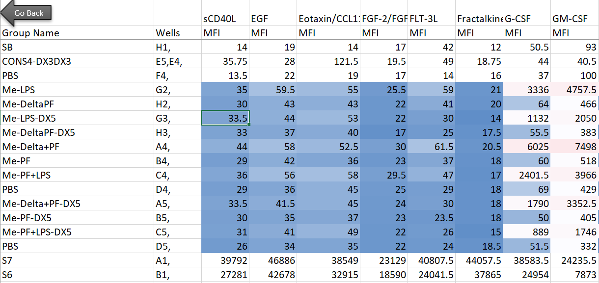
Note that I’m showing here the average MFI values, rather than interpolated values (reported as concentrations of each analyte), because the Luminex experts recommend using the former for visualization and statistical purposes. I also want to note that although I use this dataset as a model for high-dimensional data, the analyses below can be adapted to many kinds of similar datasets (i.e. protein/gene microarray, imaging datasets with quantitative parameters, RNAseq, metabolomics, proteomics, etc).
Going digital: Moving your biological data to R
Now what? A good first step is to try visualizing our dataset first, to see if we can pull out any trends or proteins of interest. You could try to make individual bar graphs or heatmaps in Excel or Prism, but nothing beats R here for ease, flexibility, and publication-ready images. First things first: transforming the data for export in R.
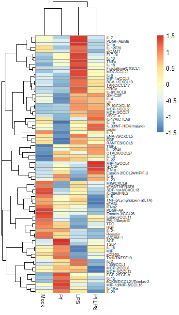
For an experiment with so many datapoints, a heatmap is a very popular way to begin analysis (think RNAseq, the OG heatmap application for biomedical data). We need to think a bit about how to transform the data before we just stick it in a heatmap, however, and there are a few options for this.
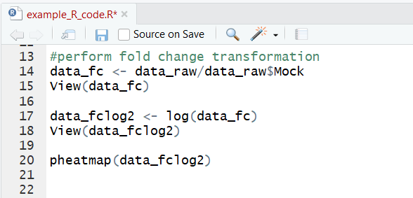
Option 1: Normalize to a control sample and perform log2 fold change transformation
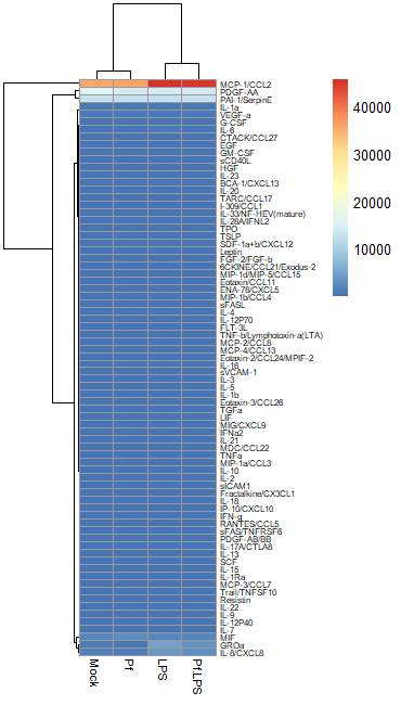
In most large biological datasets, you’ll have some parameters that vary on a really large scale (i.e. a protein that goes from 0 pg/mL to 20,000 pg/mL depending on the sample) and some that vary on a more modest scale (i.e. 0 to 10 pg/mL). If you try to put these unmodified concentrations into a heatmap, you won’t be able to see any meaningful variation in the small-range parameters, because the high values from the large-range parameters will dominate plot. Here’s an example, where the scale units are in pg/mL:
So in order to correct for this effect and allow us to bring most values within a visually meaningful range, we can perform a log2 fold change transformation (again, heavily used in transcriptomics as well). This involves dividing all the values for a given analyte across all your samples by a designated control sample (i.e. untreated, PBS control, healthy control, etc), and then taking the log base-2 of all those transformed values. That will give your controls a value of 0 (because Log(1) = 0). We can do this in Excel prior to data import or in R. Here’s an example of a log2 FC-transformed dataset:
Option 2: Import untransformed data and use a Z-score transformation
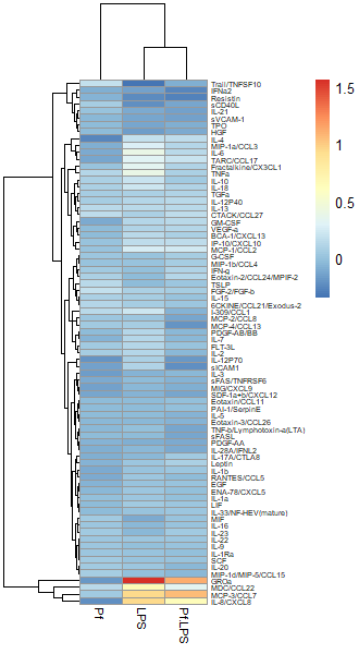
Another commonly used transformation for heatmaps is to perform a Z-score transformation across all the values of an analyte (typically across the rows of a heatmap). The heatmap R package typically can do this for you. The transformation is as follows: say we’re looking at protein X. Take the mean and find the standard deviation of all protein X values across your dataset. Then for each individual protein X value, subtract the average and divide the whole thing by the mean. For more detail, take a look at this article. Basically, you’re standardizing the distribution of datapoints for each analyte in your sample. However, some things to note: if the standard deviation across protein X values is small, then this approach will magnify small differences and make it look like you might have an interesting change across samples (based on the heatmap alone). I would always recommend looking back at the raw data and making bar plots/violin plots/etc for individual potentially interesting targets! Here’s an example of a Z-score transformed dataset (the same one as above, but the scale bar units are standard deviations away from the mean).
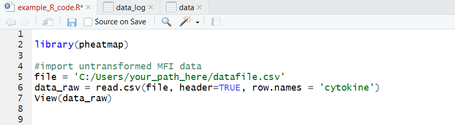
Regardless of what transformation you choose to use (and I would recommend just trying both and seeing what looks best to you), we need to move the data into R as a dataframe. I use the pheatmap package to make my heatmaps, because I find it highly intuitive and customizable, but there are tons of options out here. The basic format you want is this:
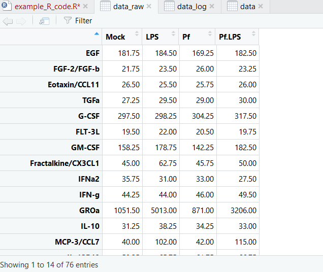
It’s a CSV file with sample names as column headers and parameters as row names. Note that duplicate sample or parameter names are not tolerated. Now we’re ready to import! Here’s a sample code for this:
And here’s what our dataset looks like now:
Now we’re ready to make pretty pictures!
Graphing heatmaps in R
If this is the first time you’re using pheatmap, you’ll probably need to download the package—that’s the first line in this codeblock. The we can attach the package to our workspace and generate a basic heatmap using Z-scores:
Now we can perform a log2 fold change transformation on the original data and graph that:
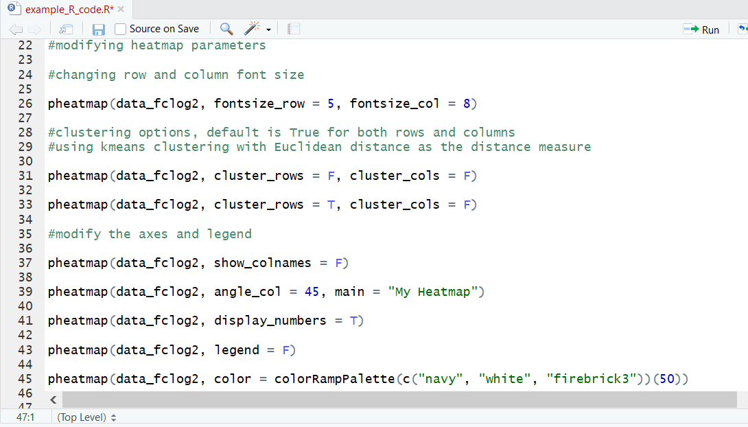
We can also get fancy and change many stylistic aspects of the heatmap. We can alter the font sizing on both the rows and columns, add, remove or change the axis names, add a title, change the color map used, and more! I’d recommend looking into the documentation to get a sense of the full range of options.
Graphing plots from high-dimensional data in R
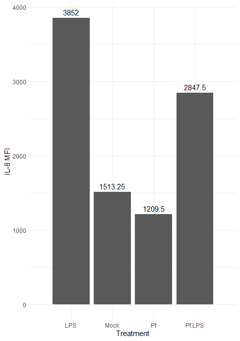
Hopefully you’ve seen something interesting in your heatmap by now, and you want to take a closer look—let’s make some individual plots. For this we’ll use the very popular R package ggplot2. Let’s make a bar plot for an individual parameter:
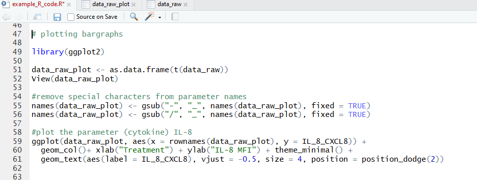
Note that we first transpose the dataframe to make it easier to reference in the ggplot function. We also needed to remove hyphens and slashes (which are treated as special characters by R) from parameter names. We then make a pretty basic plot, adding some axis and bar labels. The amount of customization you can do with ggplot2 is awesome, and I’d encourage you to take a look at their vignettes and docs (all on the tidyverse website) if you want to do a deep dive!
Here’s the resulting plot:
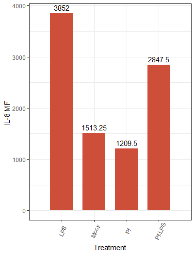
We can change the color scheme of the bars, alter the plot “theme” (i.e. the general look, which includes things like borders and the background grid), angle of axis labels, and the width of bars. Here are some of those changes implemented:

And the resulting plot:
We also have the option to create other types of plots in ggplot2, such as violin plots, scatter plots, and histograms, depending on the type of data. If you have multiple replicates per condition, a box plot can be used to get a sense of distribution and outliers. A great resource I use in my own work is this master list of different plotting options.
Finding biological meaning from significant parameter lists
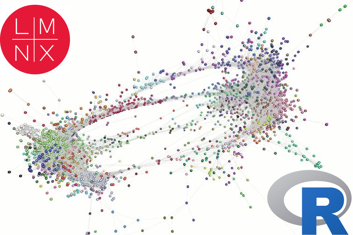
One of the most exciting aspects of multi-parameter large datasets is hypothesis generation—lots of new ideas to head back to the lab to test! Say you’ve found a set of proteins that appear significantly upregulated/downregulated relative to a control sample. How do we go from list of interesting proteins to biologically relevant question? A common approach is to plug that list into a publicly available database of pathways and gene/protein connection maps. Some examples include PANTHER, GO, and KEGG (typically used for gene list analysis but also very helpful for protein lists), as well as STRING, which is targeted towards lists of proteins. The header image for this post is an example of a STRING protein network! As a side note, if you’re working with proteomics data (of which this Luminex dataset is an example), make sure to convert the protein names to gene names prior to plugging the list into these databases. Another great tool is Enrichr, which collates many of the databases just listed and also includes things like transcription factor perturbation databases and clinical disease-gene linkage databases.
All of the websites listed above are free, but if you’re really lost/don’t want to spend the time sifting through different potential pathways and comparing results from different databased, iPathwayGuide is a fee-based option: you give them your dataset and they use proprietary databases and analysis strategies to output targets to follow up on.
And finally, you might consider comparing your list of interest to a knockout dataset—this one is a bit more work and computation than the approaches described above. For example, say that you’ve plugged your list into GO and it’s likely that all the perturbed proteins are downstream of STAT3, a master regulator of signaling. One way to strengthen this finding is to compare your list of perturbed proteins to a comparable dataset (i.e. same or similar stimulus and time point, same or similar cell type, ideally same species) in the literature and assess the amount of overlap. You would start with a literature search for STAT3 knockout/knockdown experiments, find a transcriptional/ proteomic/ metabolic/etc. dataset, and compare the list of perturbed genes/proteins to your list of interest—this can be done by Venn diagram or heatmap. Fisher’s exact test is often used for evaluating the significance of two lists. Lots of overlap/high significance by Fisher’s exact test tells you there’s a high potential for STAT3 involvement in your phenotype of interest!
Whatever your dataset, there’s a wealth of computational and internet-based solutions for digitizing, visualizing, plotting, and understanding the underlying biology. Biodock makes processing and analyzing the complex datasets easy, starting with complex microscopy images (ex: multiplexed images, fluorescent images of complex biological structures, etc.).